Thanks Heidi Klein for this opportunity. The work I completed for the editing task can be found below.
The 'before' images are on the left, with the edited 'after' imagery by me, the right.
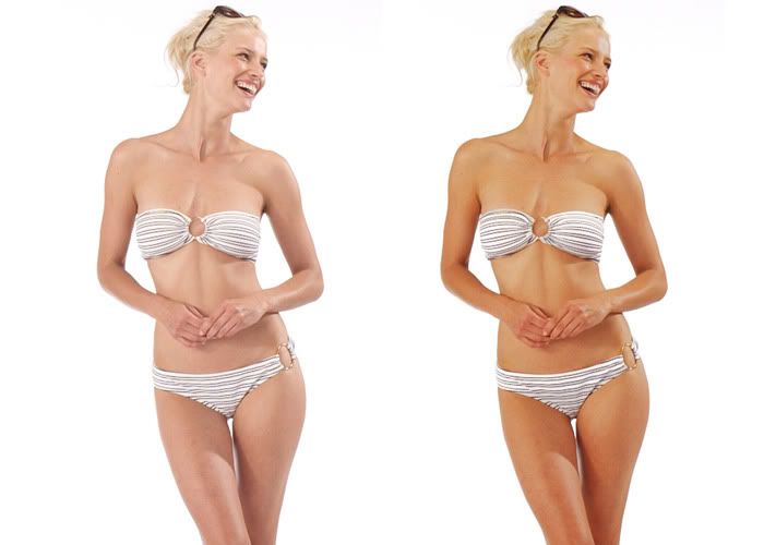
The first task was to darken this model's skin colour, which was simply done by altering the hue/saturation of the image. I managed to do this without selecting all her skin individually as her bikini is already white which means it would hardly change colour if the hue/saturation was changed.
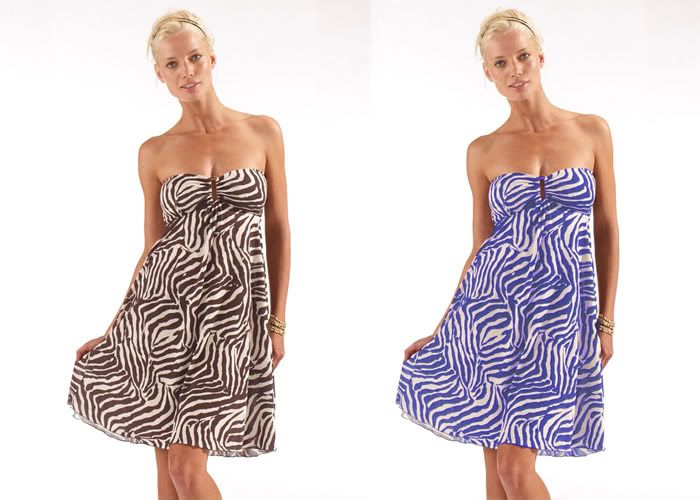
Another colour change, this time her dress had to become the plum colour alternative. Using the website as reference for the colour, I used the magic wand tool to select some of the print on her dress and then by 'selecting similar', it automatically picked out (mostly) the remaining pattern of her dress. Once selected, it was then easy to change the hue and saturation once again to get the correct tone.
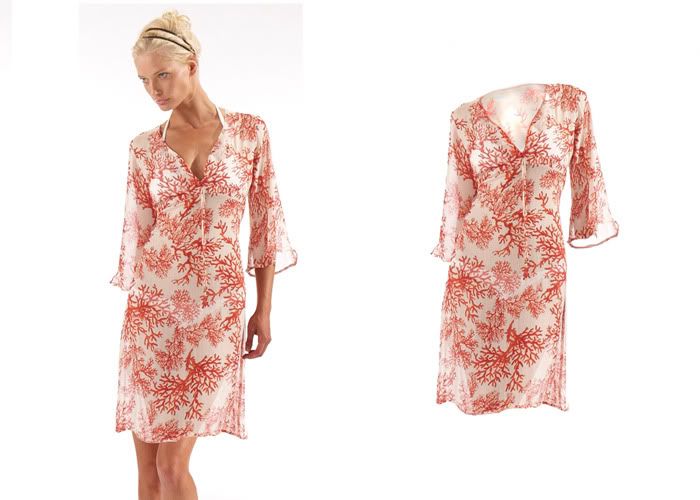
This piece became more tricky as I had to cut-out the garment from the model.
Erasing her head and arm and legs weren't a problem at all, but I had to be particular if I wanted this to look genuine. Using a mixture of paint tools, blurring, sharpening, burning, dodging and patching tools, I carefully edited in the 'back' of the dress seen on the sleeve and neck.
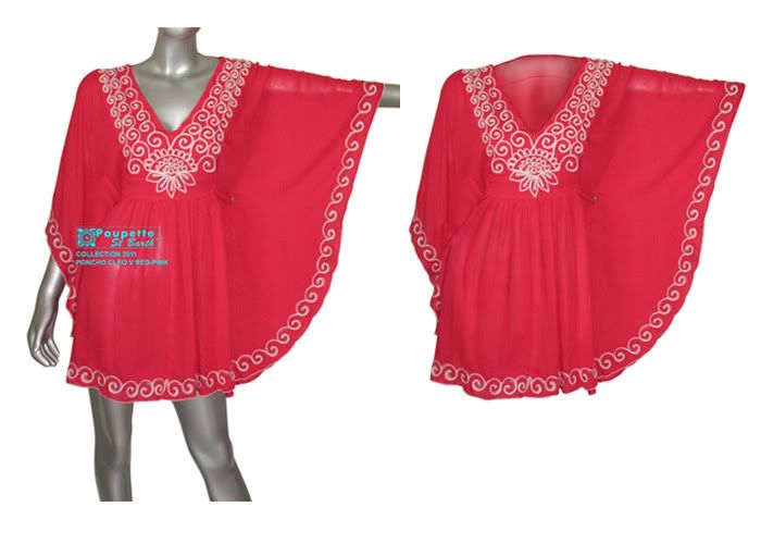
Again, another task to cut-out of the garment from the model or mannequin in this case, but also this time, to edit out the logo covering part of the poncho's skirt. A repeat performance of erasing the body parts and creating fake 'backs' to the neck, and then using another mixture of patching tools, dodging, burning tools, etc, and finally a very light opacity paint wash of the original colour to blend it all back together. I feel this one came out quite well.
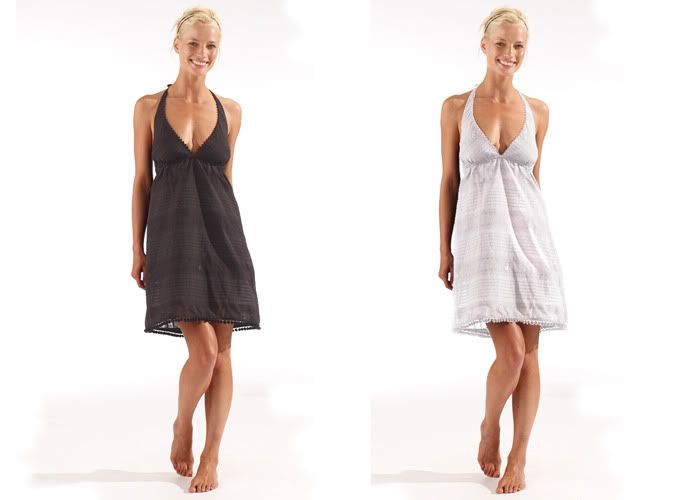
I thought this one was going to be incredibly difficult but I was pleasantly surprised! A simple colour change from black to white was all that was needed here. Selecting the dress using the magic wand tool and playing around with the contrast and brightness tool, I was careful not to whiten the dress out beyond recognition from the white background, but I also wanted to be able to keep the defining and embossing line patterns on the dress which I feel is important to be able to see.
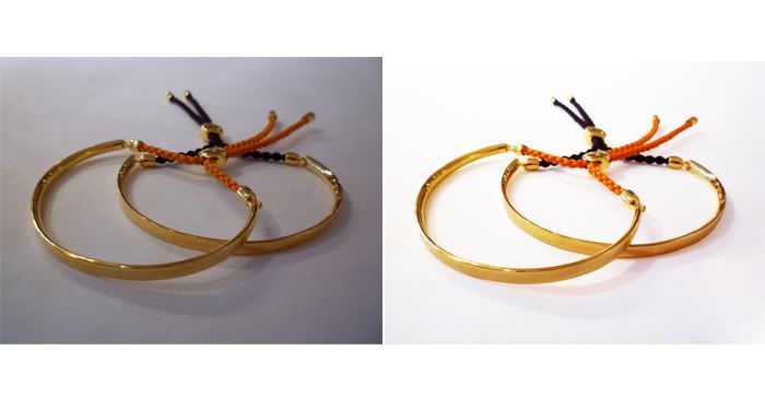
The final image required the image to be made suitable for the website.
It needed the bangles brightening up definitely, but more importantly, that background needed sorting out! I ended up carefully using the pen tool to draw around them, erasing the whole background including the shadows, then, once the bangles were separated from the background, brought in the original image on another layer and wacked up the brightness so that the background would become cleaner and whiter with paler shadowing. The bangles I had cut around originally I then laid over the top and brightened up by altering the brightness, contrast and saturation tools.
Take that, bad lighting!

No comments:
Post a Comment