One of the great things about working on the Santander account is that it has opened my eyes to the world of infographics. The simple ways of illustrating information is something I love coming up with and certainly reinforces the 'less is more' theory. They've even inspired a lot of the design on my new website. The following were all created for
Santander's Facebook pages.
Two options for the
'The least expensive towns to refuel' infographic. The first one was chosen.
'The most expensive towns to refuel' infographic. Unfortunately I live right between 2 of those places.
To the left is how my petrol infographic ideas were born! Various doodles on my notepad depicting roadsign shapes, roundabouts and other related icons.
These infographics were based on tips quoted from customers on the Santander Facebook page.
This scamp shows my thinking through from 'pie' charts to chef hats, and the original brainstorm that led to my idea of the 'fuel guage' on the trolley depicting how hungry someone is.
The Chinese New Year infographic was created for the Santander Student Facebook page. It was required to show where and when in the UK you could celebrate Chinese New Year, and also that you could travel by train (and therefore that you could use your student discount to do so).
I did so by brainstorming different classic Chinese themes and icons and then came up with the Chinese calendar, which is when I worked the information into my own version.
I was asked to do these presentation slide infographics to illustrate the facts and figures of work that we do at Hogarth on the Santander account. I wanted to join together these facts into a 'journey' of information and so created a line that should be followed with highlighting icons throughout.
The infographics were born on my notepad as above.
P.S Please ignore the great dark twirly thing, I think I was waiting for something to load/uncrash.
And finally, a simple infographic showing how house prices have risen over the past few decades.


 It started with a mindmap.. as always, and the first scribbles on the right depict what we could do with obsolete weapons once we have World Peace and there is no use for weapons anymore.. Plus a quick doodle of Banksy's famous flower-throwing rebel.
 Left: Poppies, the flower of rememberance, quick ideas on how they could promote Peace Day (21st September).
 Left: 'Put down your weapons and make Peace' - the visual is a peace dove made up of weapons. Although I liked this idea and thought it would make a great visual, I wasn't sure if the dove was restricted to only Christianity, and didn't want to exclude any other religions or cultures.
 Left: Another mind map plus another idea stemming from the 'Death to Violence' concept, a white sheet covering a gun, with the outline still evident, the slogan reading 'Rest in Peace'.
 Left and Right: Using the notion that weapons will become obsolete and to encourage people to 'put down their weapons'/throw them away, I thought of editing the traditional litter bin symbol to a man throwing away his gun. This could then be extended by incorporating a large, oversized bin into a town centre, featuring the edited symbol, slogan, logo and date of Peace Day.
 Left: Going back over anything I might have missed with another mind map.
 Left: Choosing to look deeper into the Superhero idea.. another mind map! This time focusing on the elements of superheroes that I could work into the idea or that might spark off others.
 Left: Looking at existing examples of mask design for shape, etc.
 Going back to the idea that Peace Day is also the Superheroes day off, I play with some quick fineliner sketches of classic superheroes chilling in deck chairs...
 ... and incorporate how each superhero might relax. Wonderwoman would have her own custom-made bikini of course..!
 Left: Fiddling with how it could look if the Superheroes are the ones handing out the flyers. This, since they are famous, colourful, bright and would stand out so much on the highstreet, could really grab a lot of attention to the cause.
 Another idea to branch off from this is how a poster for this campaign could work. A spoof of the traditional Lord Kitchener/Uncle Sam "We Need You" war poster, could easily be curbed to use (for example) Batman, telling the audience that "We Need You to Save The World", and obviously it would continue to advertise Peace Day being on September the 21st.
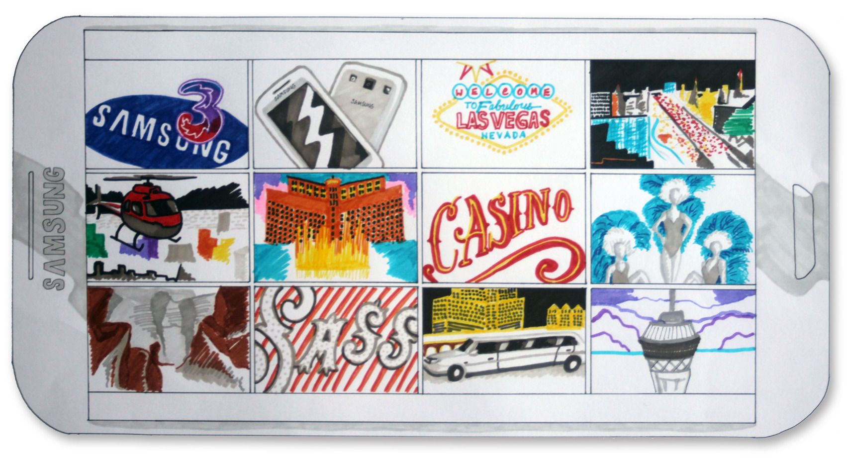 Above is the hand-sketched moodboard illustrating the features and colours of Las Vegas. In doing so it brought together the elements of what could be featured on the poster.
 Using the neon Las Vegas signage, I edited the infamous sign to feature the main text for the poster, and so kept this consistency using a slight glow-effect on the body copy to keep within this theme. The idea is that the sales agents have to 'use'/sell the phones in order to access the prize of a trip to Las Vegas. What they 'get out of it' is what is emerging from the phone screen itself, e.g the Las Vegas night scene, dancer illustrating the show and the limo.


