Thursday, 28 January 2016

Santander HR: British Heart Foundation


Santander's charity of the year was announced as the British Heart Foundation and we were invited to create their internal collateral to promote their new charity and events.

They required a series of large-scale posters, stationary, as well as digital banners for Santander's intranet. All these had to be created in the brand's then current HR style which was cartoon people. This style had great flexibility and meant all manner of ideas and designs were possible.

I pushed the concept of doing so many 'steps' for charity by using a series of characters all 'stepping' in various ways. Some were images we already owned, some were tweaked so they all looked different and others were drawn from scratch. Placing them in a heart shape to push the charity's image further as well as keeping the colour scheme strict worked to both brand's advantages.

Image and video hosting by TinyPic

Monday, 18 January 2016

HIV (REVAMP)


I created a poster series for HIV awareness when I was in university. I had already become very attached to design for advertising and wanted to pick a tricky subject which had been done many times before, but to do it in a different way. I chose a new angle on the subject, researching statistics and realising that a lot of the spread of the virus is ignorance and a plain unawareness that they have it at all. Whilst this was the right way to go, I originally had too many ideas all rolled into one and what I really needed to do was the keep things simple.

In this revamp, I continued the target audience (as those who are simply unaware of their virus, and of course the suggestion that they could very easily pass it onto their partner without meaning to), but looked at some great use of stock imagery which could help me to send the right message in a very 'romantic' way. The three poster ideas were chosen as typical 'coupley' images, using photoframes, flowers and cards as a basis for the copy "You're the reason I live, and the reason I die."

Image and video hosting by TinyPic

These ideas could easily be translated into design for a website, digital banner, leaflets within a doctor's office, at student unions, fresher fayres or in freebie packs.

Below are just some of my initial ideas and rough scamps that I needed to get down on paper. Not only are there notes and drawings for concepts, but also ideas the angle of photography, and how a leaflet design could work.

Image and video hosting by TinyPic

Please note that all photographs belongs to Shutterstock.

Skin Cancer Awareness (REVAMP)


This self-initiated brief began back in 2007 at college as a simple idea for an advertisement to raise awareness of skin cancer.

I set out to do it in a way that at the time differentiated (and may still do) from the norm which was to use shock tactics in order to translate the message to the viewer. I instead wanted to use humour and memorable imagery to capture the information and I was very happy with the result. Even now, years later, I am completely in the 'less is more' boat and I feel that the simplicity of the metaphor carried off by the copyline continues to work, which is why I wanted to revamp the design and to expand the collateral into other formats.

Using Cancer Research as my hypothetical client, I used their colour palette within the design to ensure a direct link to the branding.

Image and video hosting by TinyPic

Poster series:
Although I took inspiration from the positioning of the original posters, I introduced some more up to date facts to base the images on. I have also created a new method of displaying the bodycopy through use of a coloured strip, with the copyline contained within a breadslice vector shape.


Image and video hosting by TinyPic

Leaflet design:
I continued the style into a leaflet, using a simple square design and allowing the bright colours, layout and photography draw the viewer in.


Image and video hosting by TinyPic

Light-Sensitive Billboard:
Expanding the idea onto a bigger, and more interactive scale, I looked into a simple billboard design, but with a twist. Parts of the image would be printed using a light-sensitive ink. This would mean that when the sunlight shines upon the print, the bright blue sky and the burnt texture on the toast would be revealed. This would be not only a reminder, but also a warning to passers by that they need to be careful with sun exposure to their skin on that day.


Because of the simplicity of the design and the flexibility of the imagery, I have no doubt that this idea could be translated into all sorts of formats – whether that be other print items, digital banners, a website design, or even an advert in motion.

Sunday, 3 May 2015

International Women's Day/No More Page 3


I've been avid follower of the No More Page 3 Campaign for a long time now, and I wanted to contribute creatively to the cause. I spoke to the creators of the campaign who said that they would only be interested in ideas that do not focus on using women's bodies to draw attention - as it would be contradictory - so with this is mind, I set about coming up with an eye-catching design that could also integrate itself in 'real-life' e.g not just printed collateral.

With International Women's Day (IWD) approaching (March 8th) I decided to combine both causes with a focus on the objectification of women.

Working backwards, my final designs focused on the use of paper-chain women, which were used in different ways to reflect the three messages for my poster series. I thought that these paper-chain women not only represented the joining of people and of society, but could also be used as an eye-catching and decorative piece. I set about decorating an area near Southbank, London, which was chosen because of the various events in the area focusing on IWD.

Image and video hosting by TinyPic

My scamps and initial ideas follow, of which I found there could be quite a scope for flexibility of the original idea, given more time, a team, and a slightly bigger budget for materials..!

Fun fact: the 250 paper women took me 2 weeks of evenings/weekends to cut out by hand (I work full-time anyway), and were made from a roll of white wallpaper since it needed to be thicker than regular paper to stand up to being hung on railings in the wind.

Image and video hosting by TinyPic

Saturday, 4 April 2015

Je Suis Charlie


As a big supporter of free-speech, I was one of the millions shocked by the attack on the Charlie Hebdo offices in Paris - particularly after having left Paris less than 24 hours before it happened.

Eyeka then set a brief for creatives simply "to show your support to creativity and freedom of speech" which is what I did.

I went through a mass of various ideas (see ideas and scamps below) but as a huge believer of 'less is more', I finally settled on something that seemed poignant yet simple.

Image and video hosting by TinyPic

Image and video hosting by TinyPic

Sunday, 25 January 2015

Shrek the Musical Typography


So I first saw Shrek the Musical when a friend bought the DVD round to watch. I had seen the animated films and thought they were great stories, but didn't see how it could work as a musical.

OH MY GOODNESS. I fell completely in love and finally went to see it live in Oxford in September. Everything was perfect; from the costumes, to the music, the characters, the acting, to the astoundingly creative sets, to the very toungue-in-cheek humour which worked for audiences of all ages. But behind all this was still a great story about learning to love yourself for who you are.

The lyrics in particular for me I found very beautifully written, so much that I was inspired to use some of my favourite lyrics to create some typographical visuals. Credit for the fontface goes to Kevin Wilson.

Image and video hosting by TinyPic

Saturday, 17 May 2014

Hidden Spire


 photo HiddenSpire1.jpg
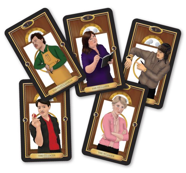
Just before Christmas time I was commissioned to create some tarot card character designs for the play Hidden Spire at the Old Fire Station in Oxford. Above are the finished products.

 photo HiddenSpire3.jpg
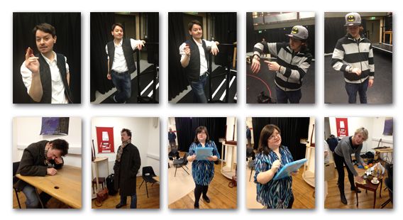
They needed to be realistic representations of each character in the play, but digitally illustrated to match a particular chosen style. I was given some reference photos of the characters to work with (see above), and had to add their costume in at a later date once it was confirmed what they would be wearing for their performances. I completed my designs by handdrawing the outlines of the characters, filling in colour, texture, tints and tones in Adobe Photoshop.

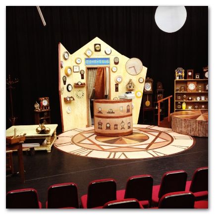
Given more time to work on this I would have loved to have created different background clock-related designs (as the play is set in a clock shop) reflecting each character's personality.

 photo HiddenSpire2.jpg
The above set design was created by the amazing Lisa Thomas.